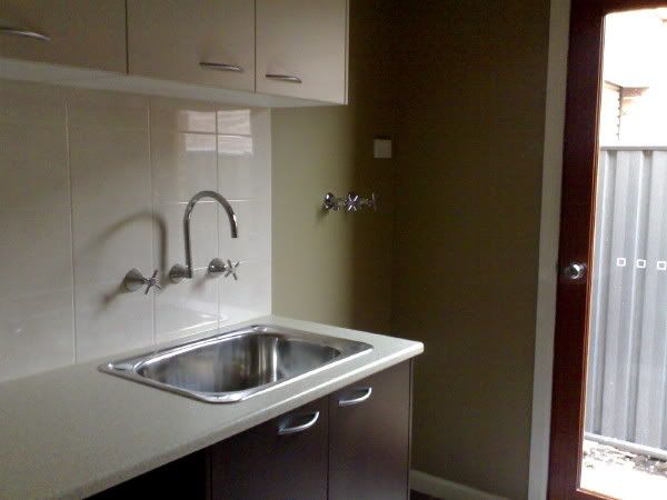
Kitchen
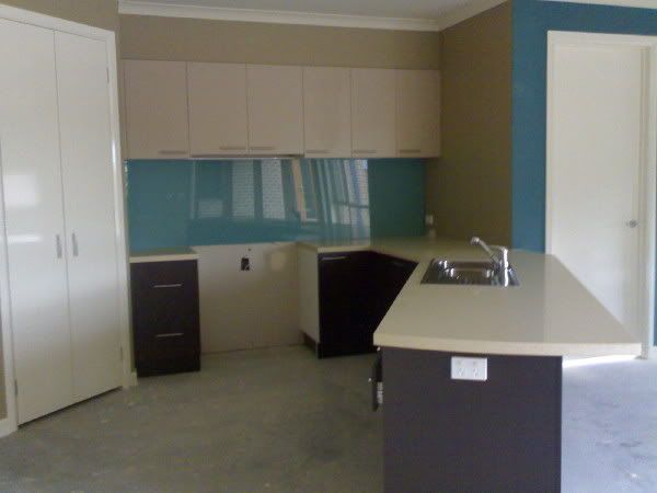
Cabinets (below bench): Formica Mocha
Cabinets (overhead): Laminex Stipple Hemp
Benchtops: Quantum Quartz Pebble Cove
Main wall colour: Castilian
Ceilings: Bone
Skirtings/trims: Pearly Gates
Splashback: Wall Street (and no, we didn't upgrade to the clear glass, the greeny tinge was fine with our colour choice)
Feature wall - you can see the edge on the right there: Castle Keep
The overhead cabinets actually blend pretty well with the wall colour, so they're unobtrusive, making the space appear larger. The colours in the photo aren't quite right.
We upgraded to the 40mm benchtop edge (I think the 20mm edges look mean) and also upgraded all cabinet handles. I think the rest was pretty standard....apart from the appliance cupboard, microwave space, piano-hinged corner cabinet door, extra pot drawers, over-fridge cabinets with fancy-pants gas lifters, wall niche with glass shelves and a downlight.... Hmm, OK, so we upgraded just a few things.
Bathrooms

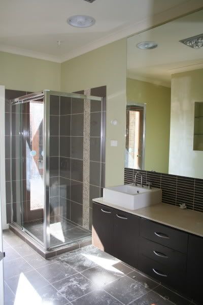
We went for the same basic scheme in both bathrooms. We paid a silly price to have the walls painted in a different colour to the rest of the house, but it was worth it. The colour is Fortune and it's a pale green.
We chose the same Mocha colour for our vanity cabinets, and Formica Amaretto Stone for the benchtops. And here's where we got tripped up: the displays we saw had vanities with standard, square-edged 20mm benchtops. The documents we got specified Shadowline vanities - but nobody told us that a shadowline vanity was different to those we'd seen. Grrr. When I saw the finished product, I was extremely disappointed - the contrasting benchtop looked CRAP. If I'd known, I'd have either upgraded to a different style benchtop, or made the benchtop and cabinets the same dark colour. Live and learn....
Anyway, with the basins, tiles and mirrors installed and the painting done, they look OK, so I've (almost) stopped bitching about them.
The tile selection looked like it was going to get expensive, because like most people, our first impressions of the Category 1 range was "Ugh. Don't like any of them." A closer look revealed that it was really only the feature tiles that were boring, old-fashioned and generally made me want to run screaming from the room. No way was I having those in MY bathrooms!
So we took another look at the main tiles, um-ed and ah-ed a bit and came up with:
Floors and shower walls (also laundry and toilet floor): Don't ask me the name, I can't remember and I'm sick of looking through my file. They were a large square greyish-brown anyway. These were discontinued at some point and we were told they were unavailable two days before the tiler was due to start. Aargh! The suggested replacement though, Kimberley Smoke, was fine. Phew. So since we'd not spent anything extra at all on the main areas, we (I) decided we could be a bit extravagant about feature tiles.
I had my heart set on pebbles, so chose Pebble Tan for a vertical strip in each shower.

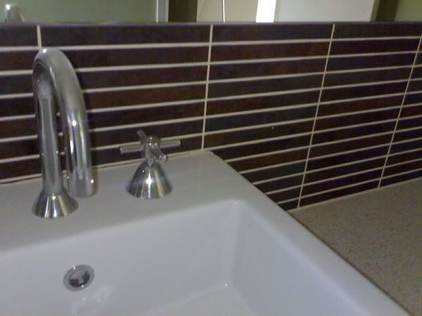
For the ensuite splashback, we loved these (they're called something-or-other Stix). The display home had similar tiles, but in a woodgrain finish that we both hated. These, we loved - and although they look like lots of little tiles, they're actually large, so we only needed a few.
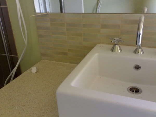
We thought we'd differentiate the kids' bathroom just a little with different splashback tiles, so we picked a super-expensive glass tile in pale green. Same deal as the Stix, they're large tiles that look like lots of small ones. And no, the icy pole sticks aren't a feature...
We held our breath waiting for the final tally on tile upgrades, and it came out to.... $500. Oh. That's all? Gee, I could have upgraded the door handles after all *ignores husband's evil glare*
There was one further upgrade later on, when I requested that the vanity plinths be tiled to match the floor. I wanted floating vanities, but they wouldn't let me have them *mutter, mutter* so this was the closest I could get. You don't even see the plinth, it just blends, which was the idea.
Laundry
Ideally, I'd have liked to do the walls in here in the same green, but hey - it's a LAUNDRY. I didn't care enough to spend extra on another paint upgrade. There were lots more things to spend up big on. :o)
So, walls, ceiling and trims are the same as the main part of the house. Again we went for Mocha cabinets and Amaretto Stone benchtops. For the overheads, I picked a neutral - Laminex Moleskin. I wasn't prepared to pay extra for tiles here either, so found a nice bland cream one amongst the Category 1 range. It's not exciting, but it's neat and functional.
The only upgrades in here were the stainless sink instead of the standard crappy white one, and a ducted heating vent. I had an indoor clothesline in our old house, for drying clothes in winter, but it was always FREEZING in there and took days for anything to dry. So we always seemed to have the good old clothes horse in the lounge. Not happening in my nice new house!
Oh, we did upgrade the taps too. Those standard laundry ones are HIDEOUS.
If anyone's still reading, I'm sure I've bored you enough now....There are a couple more feature walls though, and pics are here.
2 comments:
Bored? No way - bring it on!!! LOL! Shh...don't tell my DH you have green walls - he wanted me to have a lime green splashback...but I'm a bit too boring for that (mind you, HE changed the wall colour back to Astor White!!!)
I know yo0u've had SO many problems, but it really does look fantastic :-)
very nice.. i think my wife would kill for that kitchen..
Post a Comment